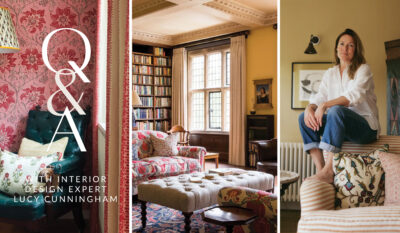
About Lucy Cunningham
An incredible decorator and designer based in London, Lucy works throughout the UK and this summer I had the pleasure to sit down with her in-person for a chat about all things interior design. Lucy’s style layers unexpected designs with refined English aesthetic. She blends the contemporary and classics, creating a timeless longevity. Greatly skilled at working with prints and colours, Lucy applies her designs with a peaceful elegance, drawing influence from nature, travel, art, and a variety of cultures and eras.
Q: How did you get into being an interior designer?
A: I’ve always been drawn to spaces that tell a story. I worked in the fashion industry and quickly realised interiors combined everything I loved: colour, pattern, texture and the way people actually live in a space. I began by helping friends with their homes, which quickly grew into larger commissions, and in 2014 I founded my studio. I have been so lucky with amazing clients, who give me freedom to be bold with my designs. From the start, my goal has been to create interiors with depth and homes that feel as though they’ve evolved naturally over time.
Q: How would you describe your style?
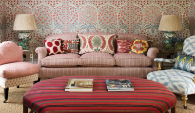
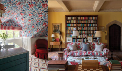
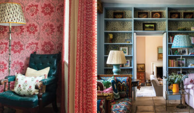
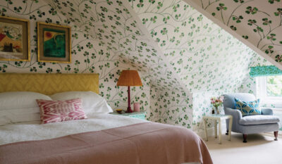
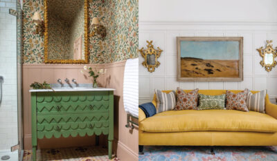
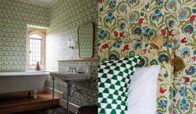
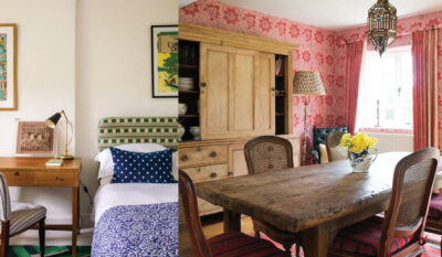
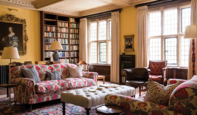
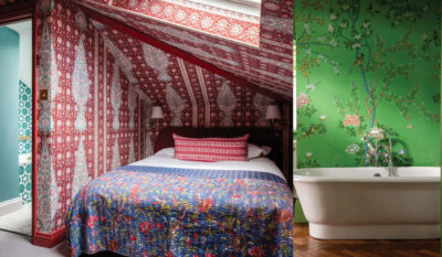
A:There are no strict rules – my main one is have fun! Be bold! Textiles are a constant source of inspiration – antique ikats, kanthas and suzanis often find their way into my schemes – balanced with historically inspired prints or clean-lined furniture. My work rests on a refined English foundation, but I love weaving in influences from art, travel and nature. The contemporary and the classic sit happily together.
Q: What are your favourite projects and why?
A: The best projects are the ones where I build a personal relationship with the client. It’s the most amazing feeling if I can persuade our client to try something different that they weren’t initially keen on, they say yes and then love it. I’m especially drawn to projects where architecture plays a leading role. Listed houses where we need to honour history while introducing bold patterns and unexpected colour to create something both fresh and timeless are a favourite. I also love the challenge of townhouses, where clever space planning and light are the most important elements.
Q: What are your favourite design trends at the moment?
A: The key to trends is to take the elements that truly resonate and let them transcend their moment. I’m not driven by what’s “in,” but I’ll happily borrow a detail I love. For example, scalloped edges have been everywhere on Instagram, but rather than covering a whole room in them, I might use a single scalloped lampshade or a trim on a cushion so it feels special, not overdone. When a colour pairing suddenly dominates, I’ll look for subtler ways to play with that palette, perhaps in artwork or a patterned fabric rather than the walls and woodwork. Another example is the resurgence of checkerboard floors: instead of a full kitchen refit, try a small-scale checkerboard in a hallway or on a painted tabletop.
Q: Do you have a favourite wallpaper designer currently?
A: There are so many talented designers out there and we’re lucky to work with so many of them. Carlos Garcia (who also happens to be a great friend of mine!) creates the most wonderful fabrics and wallpapers, he has a real eye for timeless prints and colourways. I love Guy Goodfellow’s collections, including the best stripes and plains which are much-used in my projects. I look to Namay Samay for prints and embroidered fabrics, and for the real wow factor, de Gournay’s hand-painted designs are endlessly inspiring.
Q: Easiest tools a non-designer can use to get your look?
A: Start with a single textile you love – perhaps a vintage suzani or a favourite print – and build a palette around it. Create a physical mood board with fabric swatches, paint samples, magazine cuttings that have caught your eye – things to capture the mood. Layer textures: linen against velvet, sisal beside silk. I like to throw in something dark to a room full of pattern and colour, so the room doesn’t look too neat and ‘finished’. Other ways I do this are moving away from matching pairs – for example, instead of matching lamps either side of a sofa, try differing heights or slightly different shades. Lighting is key – lots of low-level lighting that can be brought to life with pretty lampshades.
Q: You have amazing taste in colour, do you have a colour theory and what certain colours create in a room?
A: My guiding principle is to let colour support how you want the space to feel, not just how you want it to look. Colour often sets the emotional tone for a room – soft greens and blues bring calm to a study space or library, a deep plum or inky blue brings drama and intimacy to a smart dining room, especially at night. I like colours that shift subtly with the light so a room feels alive throughout the day, and throughout the seasons. I’m a huge fan of yellow – it took me ages to find the perfect yellow for my sitting room at home but I’m glad I waited for the right one: Sadhika by Atelier Ellis.
Q: How can you create an English look in an American house?
A: Begin by introducing antiques – even just one or two well-chosen pieces will instantly add depth and a sense of history. An old oak table, a vintage side chair or a gilt mirror gives a room character that new furniture simply can’t. Antique chairs that need reupholstering is an easy way to do this, too. Then resist the urge to match everything. English interiors feel collected over generations: mix different wood tones, pair a patterned armchair with a plain sofa, layer cushions in varied fabrics and scales. The aim is a space that feels lived-in and evolving, never like a perfectly coordinated set.